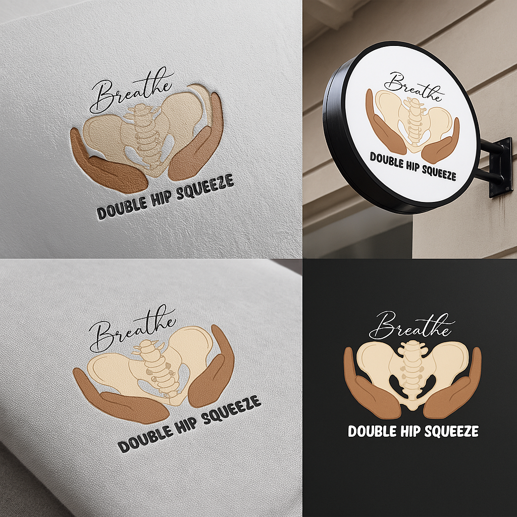
Doula Services Logo
This logo was designed for doula services and represents the supportive “Double Hip Squeeze” birthing technique. The warm illustration and soft typography convey comfort, grounding, and the calming presence a doula provides. It highlights thoughtful, wellness-centered branding for birth-work.

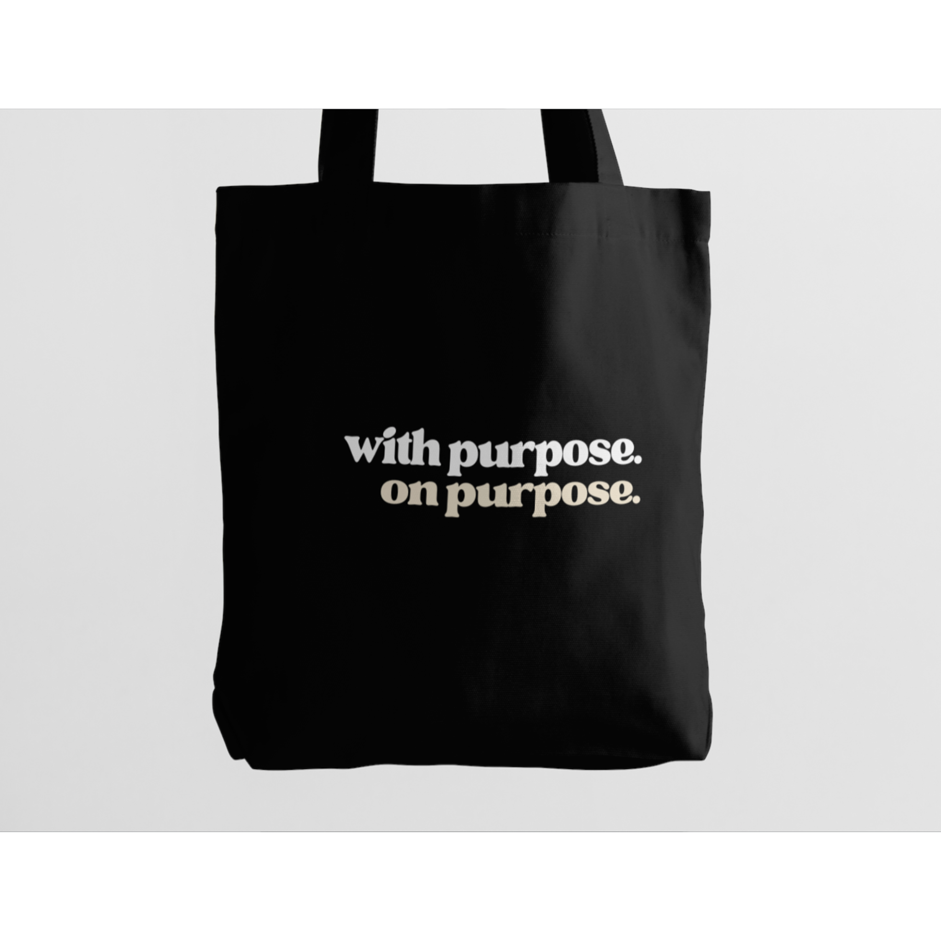
Logo Aspiration Design
This typography-focused logo built around the phrase “with purpose. on purpose.” reflects a brand grounded in clarity and intention. The clean lettering and subtle contrast create a modern, motivating mark that showcases strong typographic skills and works well across various applications.